


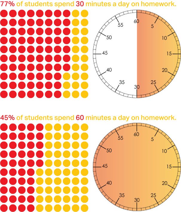
I set out on this project to show how children have far to much homework. From the studies I’ve been reading, that doesn’t seem to be the case. The findings are interesting. Here is a bit of what I’ve discovered.


There more is information that I working making visual, as well as an explanation/conclusion and some ideas for improving homework time.

For my final project, I want to explore the effects of homework on grade school children. As a parent of two grade school age kids, I spend hours each evening coaxing, coaching, helping and reminding them to focus and finish. I often wonder how parents with children who are active in sports and other after school activities, or who have more children, manage to have a quality family life with so much homework. I don’t think that there needs to be so much sent home from school to work on. What happens in the classroom? Are there assignments being done there? Shouldn’t that be sufficient? I am not the only parent with these concerns. I want my children to be more than homework drones.
Some of the sources I will use are:
Key Insights or Data

The Process Book


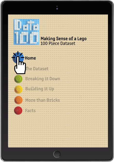
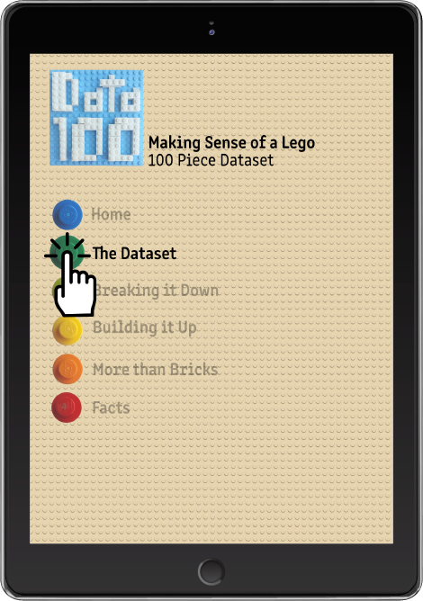
The App Layout


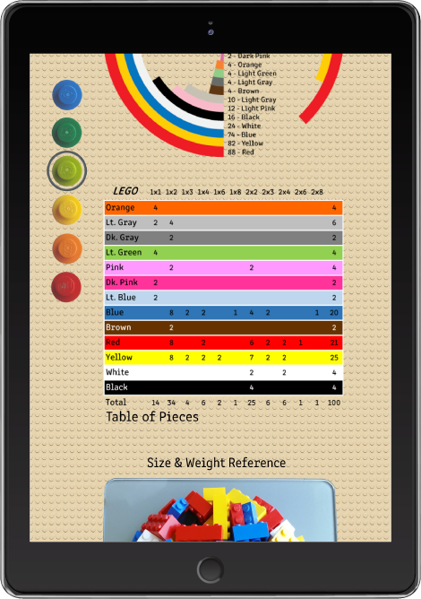


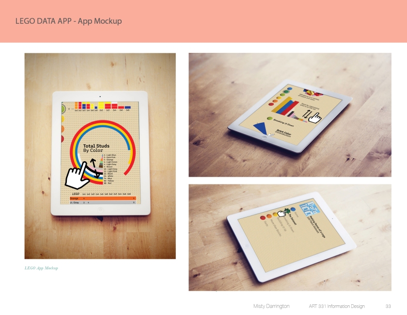
The App Mockup

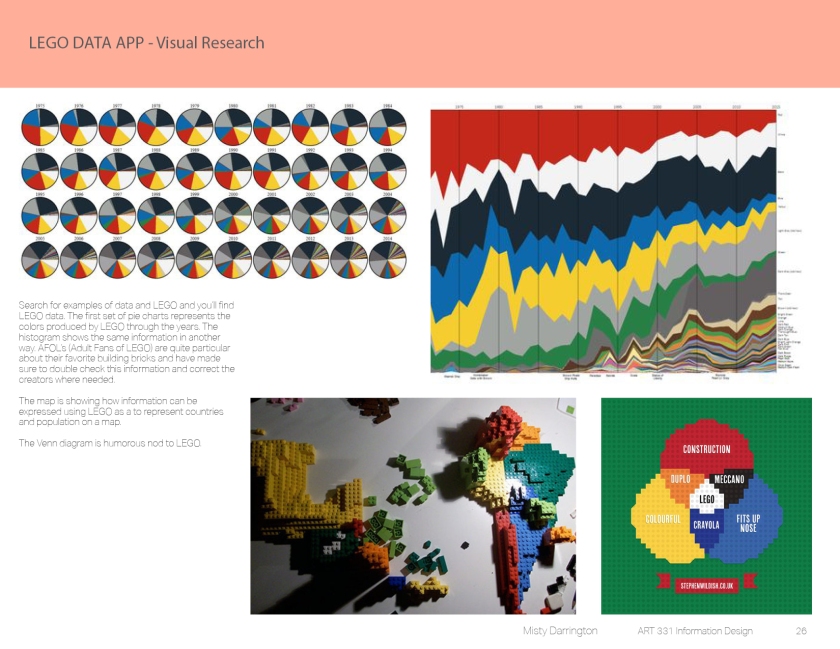
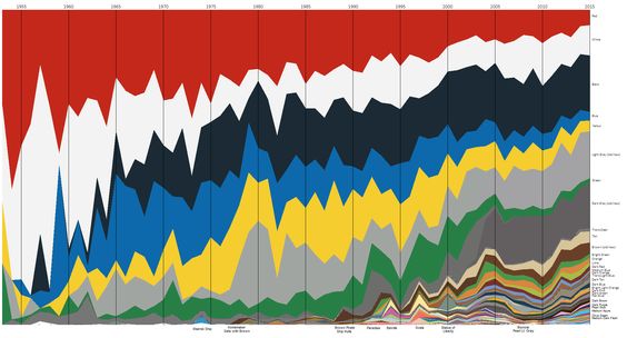
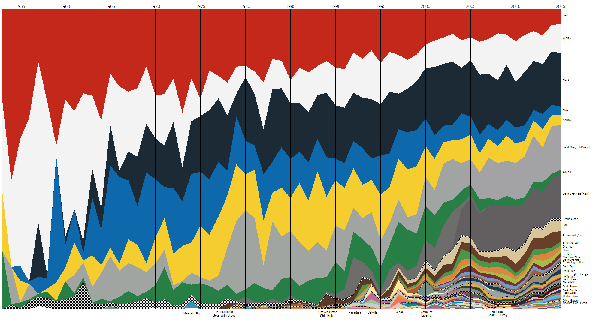
For research, found many types of data on the subject of LEGO like these graphs that show color usage by the company through the years…

In addition to data about LEGO there is data shown with LEGO. (Or the appearance of LEGO.)


I also looked for data displayed in ways that could be incorporated using my LEGO dataset.


I also researched the various types of graphing data since at least 3 specific types are required for this project…

The data representation I’ve started began with an Excel spreadsheet.

I translated the information in a couple of ways so far.


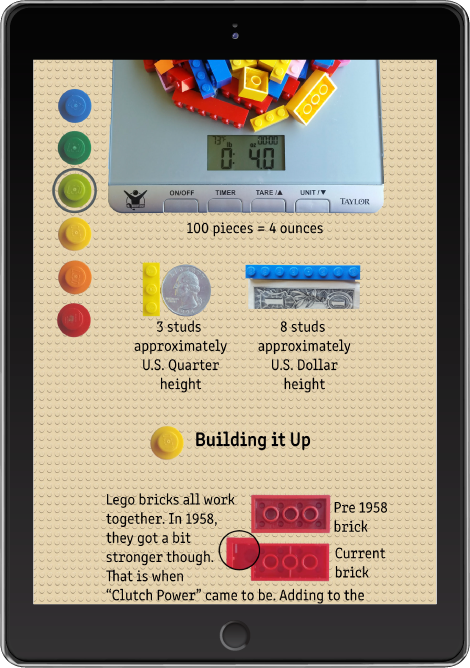
I’ve even made a histogram with the bricks I received. However, by taking a top down photograph like this, it is almost impossible to avoid changes in perspective along the edges. Perhaps, taking individual images of each set or scanning them would be better. I’m not sure I will use this image.

I’ve been researching various facts, lingo, and other notable information for use in the app design. A very interesting documentary can be see on Amazon Prime called “Beyond the Brick”.
During my photo sessions, I’ve taken just about every angle that can be taken; even perspective angles using museum putty to keep the brick angled. I would like to create a blueprint-like section with dimensions since I have a background in CAD but translating that to Illustrator isn’t as easy as I imagined.
I have more pictures to take. I need to take a picture of a stack that I am using for my menu. I also plan to use images of individual studs for bullets in my facts lists.


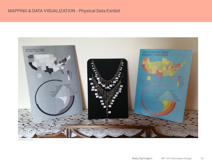


How else would a jewelry designer create a visual expression with the data of their sales? Through jewelry of course! I’ve made a crude design with Adobe Illustrator of my idea. I think that this needs to be made with bead though.

This necklace shows the sales made in the United States. The hand form is holding the international sales data. I didn’t include the data for the United States on the international “strand” since all that data is on the necklace. The data I am using is generated through an Etsy app that pulls the data from my shop. (Etsy Sale Map App)
Another way I arranged the information was in a bar graph of sorts. I took pictures of the Swarovski crystals I planned to use in the necklace and used the images for my graph.

Physical Exploration
The necklace idea was one I wanted to try. In order for the data fit better, I used 10mm beads to represent 10 sales, and 4mm beads to represent 1 sale. For the United States there are 892 sales. That’s a lot of beads!
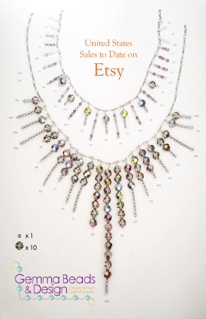
This would definitely be a dazzling necklace. There only two states without sales; Montana and North Dakota. If I were to explore this further, It would be interesting to compare the amount of sales with other things like state population. I decided to forego using the international data. The sales data from the United States was plenty to use.
To show the information on a map, I used basic colors in a graduation.

And the same map in gray scale.


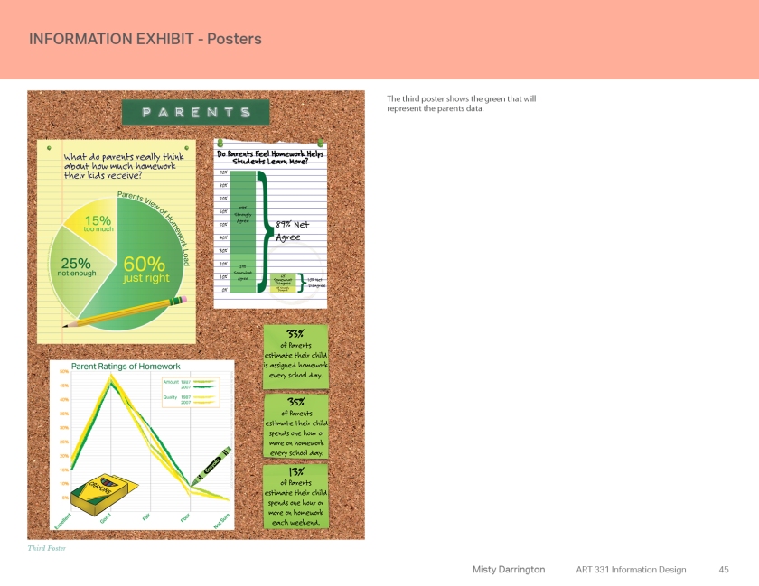
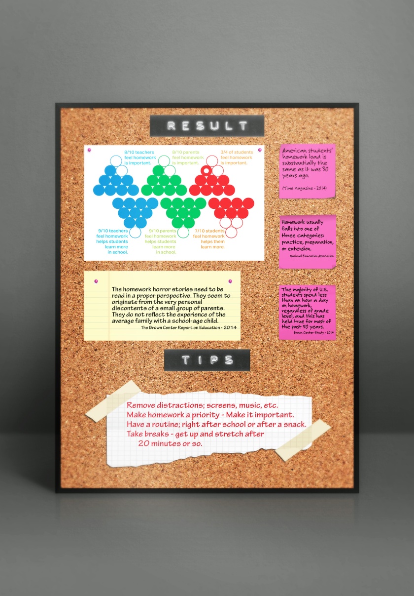
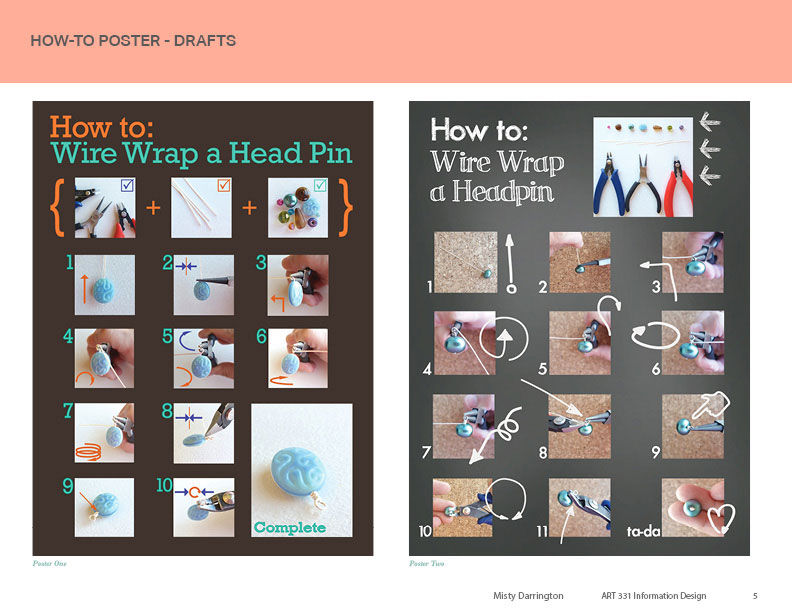
Working with suggestions made on “Poster 2” I’ve made some changes.
This is this first iteration of Poster 2…

Here is the rework of Poster 2…

I look forward to reading your feedback and critiques.


